
Looking for epic 404 page design examples to inspire your own?
The right 404 page can actually help you increase leads and conversions that you would definitely have lost. But what makes a really good 404 page? Can you create a killer 404 page without having to hire a developer? Does is matter how high-end your 404 page looks?
We’ll answer these questions once and for all.
In this post, we’re going to cover 10 of the best 404 page design examples we’ve seen. Then, we’ll explain why they work.
Hadi başlayalım.
What Is a 404 Page and Why Should You Care?
A 404 page is a custom page you create on your site that’s shown whenever someone tries to access a URL on your site that no longer exists. The purpose of a 404 page is to prevent such visitors from exiting your site immediately.
So, of course, if you don’t have a 404 page, you will lose these visitors. And 404 errors are more common than you might think. Any site that’s been running for a while will have deleted pages and posts.
A good 404 page design can help you retain visitors who stumble onto a 404 error and can then convert those visitors by redirecting them to another page.
Best 404 Page Design Examples
Now that you know what a 404 page design can do for you, it’s time to check out our list of the best designs we’ve seen. If you’re looking to create your 404 page, we recommend using SeedProd to do it. SeedProd allows you to create custom landing pages in WordPress (including 404 pages) without any coding.
Go check out our full review of SeedProd and create your own 404 page. Or, dive straight into our list for some inspiration first.
#1. PushEngage
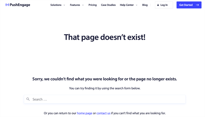
The PushEngage 404 page design is the perfect example of everything you need from an error page. There’s a clear apology message and a search bar that encourages you to stay on the site and search for the resource you need.
It also gives you the option to go to the home page or get in touch with the team.
This way, visitors have the option to stay on the site and keep browsing more content. But even more important is the use of the navigation menu. The navigation menu makes it easy for the user to go anywhere on the site instantly. And having a navigation menu in your 404 page design makes the page feel like it’s part of the same site instead of a random error message.
With this 404 page design, the goal is simple: Keep people on the PushEngage site.
You can straight up use this 404 page as a template. It’s super minimal and highly effective. So, you can re-create the page in a matter of minutes.
#2. 9gag
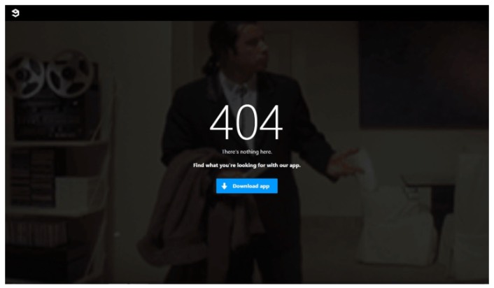
9gag has one of the most direct and straightforward 404 page designs we’ve ever seen. There’s absolutely nothing to consider for the visitor. You get a clear call to action to download their app.
It’s super focused on converting web visitors into app users and that’s all it offers. The page is super minimal and the GIF of John Travolta looking lost is an awesome touch.
Yes, we just talked about offering different ways to retain a visitor. But you can’t overwhelm them with too many options, either. For app developers, this template is pure gold. You can easily create an app landing page and link to it from your 404 page.
#3. Pixar

Pixar always takes the cake with creativity. They have one of the most fun, creative, and engaging 404 page design examples.
With one of the characters from their movie Inside Out, they play with how frustrating it can be to land on the wrong page. Then people can use the main menu at the top of the page to go back through the site.
The only critique that we have is that there is no search bar to help users find a related resource. If you’re running a WordPress site, you can set up a custom site wide search engine pretty quickly using SearchWP.
Check out our review of SearchWP to learn more.
#4. Disney
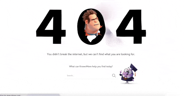
Disney’s 404 page design is also super cool. You get a search bar to find related resources.
But more importantly, everything about the page feels on-brand with Disney. The animated effect with their popular character Wreck It Ralph from their hit movie Ralph Breaks the Internet is super cute.
You also get a navigation menu on top to easily reach any page you want to find. This is an improvement over Pixar’s 404 page design. If you take a closer look at the navigation menu, you’ll see that it points to their Shop, Parks and Travels, and Movie pages. These are all money makers and every time they get someone to convert from a 404 page, it’s money that they would have otherwise lost.
#5. Netflix
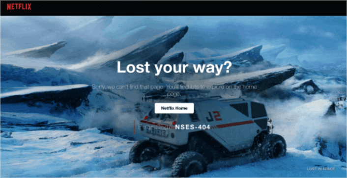
Netflix is more a discovery platform than a search engine. So, for once, we’ll let the fact slide that there is no search bar on their 404 page. And besides, how can you be mad at this design? The background is a scene from Lost in Space.
It’s so fitting that they managed to pull this off.
The main thing to notice here is the big CTA button in the middle: Netflix Home. It’s simple, effective, and very appealing. Seeing a 404 page is a very bad experience for the user. But sometimes, all you need to offer a good UX is a clearly labelled button.
#6. Tripadvisor
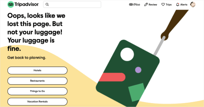
Tripadvisor has a fun and animated 404 page example. It’s a good fit for their brand and the page feels campy and fun. Almost like… taking a trip with a funny friend.
Check out the headline joke about having lost the page but not your luggage. This is the perfect kind of humor for a travel site, and it invites the user to navigate to 4 main sections of their site:
- Hotels
- Restaurants
- Things to do
- Vacation rentals
An excellent way of re-engaging the user and helping them further plan their next vacation without being pushy.
#7. Constant Contact
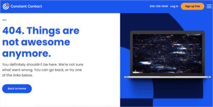
Constant Contact caters mostly to young business owners and marketers. So, while their language may feel a little informal, that’s the way it’s designed to feel.
Bu 404 sayfa tasarımı basit, zarif ve kullanıcının zihniyetini anlıyor. Gayri resmi dillerinde bile, metnin özür dileyen ve yardımcı hissettirdiğine dikkat edin.
Tek bir şikayetimiz varsa, o da metnin son kısmı hakkında. "Aşağıdaki bağlantılardan birini deneyebilirsiniz" diyor ve tıklanacak yalnızca bir bağlantı sağlıyor. Düğme etrafındaki kelimeleri değiştirmeyi veya keşfedilecek daha fazla bağlantı sağlamayı öneririz.
#8. Slack
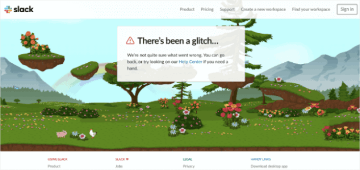
Slack, 404 hata sayfası için tamamen animasyonlu bir arka plan hazırladı. Bu yüzden süper ilgi çekici ve insanların sitede daha uzun süre kalmasını sağlamak için tasarlandı.
Elbette, kullanıcıları Yardım Merkezi'ne götüren bir bağlantıları ve ayrıca farklı sayfalara giden bir dizi başka bağlantıları var.
Ana Sayfa'ya giden bir bağlantı yok ve eksik olan tek şey bu. Burada, 404 sayfa tasarımının bir arama çubuğu içermesi gerekmiyor çünkü site araması yapabileceğiniz Yardım Merkezi'ne bağlanıyor.
#9. Steve Madden
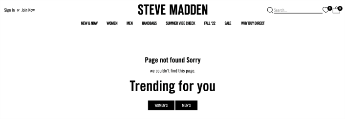
Steve Madden'ın 404 sayfa tasarımı, kayıp ziyaretçilere birden fazla seçenek sunuyor. Sitede ürün bulmak için arama çubuğunu kullanabilirsiniz. Ancak kategori sayfalarını bulmak için bir gezinme menüsü de var.
Ardından, sizi trend ürünlere yönlendiren iki CTA (Harekete Geçirici Mesaj) alırsınız.
Bu 404 sayfa tasarımının her santimi, sitede geçirilen ortalama süreyi artırmak için tıklamalara göre optimize edilmiştir. Bunun gibi bir sayfa oluşturmak da çok kolay. Tek yapmanız gereken SeedProd'un e-ticaret bloklarını kullanmak.
#10. Amazon
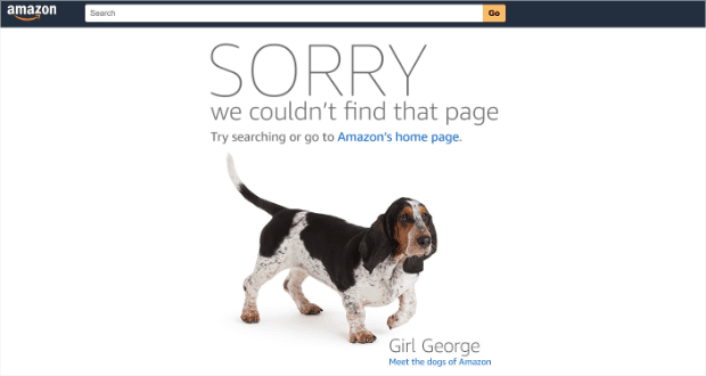
Amazon 404 sayfa tasarımıyla eğleniyorsa, o zaman sizin de eğlenmeniz gerektiğinin açık bir göstergesidir!
Sayfa, büyük, kalın harflerle bir özürle başlıyor. Ardından kullanıcıları Amazon'un ana sayfasına yönlendiriyor VEYA kullanıcıların "Amazon'un köpekleriyle" tanışmasına izin veriyor. Bu neşeli yönlendirme, insanların sitede daha uzun süre kalmasını sağlamak için harika bir yoldur.
Sonuçta, kim köpekleri sevmez ki?
404 Sayfa Tasarımını Bitirdikten Sonra Ne Yapmalı?
Bu kadar, millet!
Bir 404 sayfa tasarımı oluşturmak, çevrimiçi bir iş kurmanın aslında en kolay kısmıdır. Zor kısım, sitenize trafik çekmek ve insanların sizden sürekli alışveriş yapmasını sağlamaktır.
Önerimiz, anlık bildirimlerle başlamanızdır. Anlık bildirimler, etkileşiminizi ve dönüşümlerinizi artırmak için harika araçlardır. İkna olmadınız mı? Anlık bildirim kampanyaları hakkındaki bu harika kaynaklara göz atın:
- Aboneleri Web Anlık Bildirimleri Kullanarak Alıcılara Dönüştürme
- Yeni WordPress Gönderilerinden Aboneleri Haberdar Etme
- Daha Fazla Satış Elde Etmek İçin Stokta Kalmayan Ürün Bildirimleri Gönderme
Anlık bildirimlerinizi göndermek için PushEngage'i kullanmanızı öneririz.
PushEngage, dünyada 1 numaralı anlık bildirim yazılımıdır. Bu nedenle, henüz yapmadıysanız, bugün PushEngage ile başlayın!


