
Looking for some hello bar examples to elevate your website’s first impression?
A well-designed hello bar isn’t just a warm welcome for new visitors—it’s a golden opportunity to re-engage loyal users too. Make it count.
Today, I’m diving into our top hello bar examples to spark ideas for your brand’s perfect look, style, and message. And don’t worry — I’ll walk you through just how simple it is to add each type of hello bar to your site.
But before we jump in, let’s get crystal clear on what a hello bar is and why it’s such a game-changer.
让我们开始吧。
立即发送网页和应用推送通知!
推送通知是一种超级有效、低成本的营销工具,可帮助您自动增加重复流量、互动和销售。
What’s a Hello Bar?
A hello bar is a sleek website feature—a customizable bar that usually sits at the top of your page. Its goal? To catch your visitor’s eye with a short message or call-to-action, whether that’s signing up for a newsletter, subscribing to push notifications, or snagging a freebie.
Think of it as the polished cousin to the popup—less disruptive, more user-friendly. While it stays visible as your visitors scroll, it subtly encourages interaction without compromising the flow of your site. A win-win for engagement and UX.
Also known as floating bars, sticky bars, welcome bars, or announcement bars, these tools are a go-to for site owners and digital marketers looking to boost conversions and spark more engagement.
What Does a Hello Bar Do?
Hello bars are a versatile tool that can help you reach your marketing goals, as we’ll see in the examples ahead. You can use them to:
- Announce company updates or a flash sale
- Welcome first-time visitors
- Offer lead magnets to grow your blog subscribers
- Boost webinar registrations
- Provide purchase incentives like discounts, coupons, or free shipping
- Redirect traffic to product pages to increase sales
And much more. A hello bar is a powerful addition to any marketing strategy. Now that we’ve covered the basics, let’s dive into some hello bar examples to spark your creativity.
Best Hello Bar Examples
I’ll walk you through how to create the campaign and explain why each hello bar example works so well. With that said, let’s dive into our favorite hello bar examples.
NOTE: The words “hello bar” and “floating bar” refer to the same feature, so we’ll be using both terms throughout the post.
#1. Grow Your Subscriber List
First up in our hello bar examples is a straightforward floating bar from ActiveCampaign, positioned at the bottom of the page:
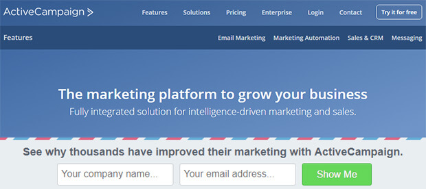
This clean design, featuring an email signup form, is perfect for growing your email list.
ActiveCampaign used OptinMonster’s Postal Lead Generation template, which contrasts nicely with the main site. They tweaked the copy to include social proof, stating that “thousands have improved their marketing,” while the phrase “see why” sparks curiosity.
This simple yet powerful approach brings in 800 new signups every month. For more details, check out the full ActiveCampaign case study.
#2. Attract New Leads
Advisor Coach also saw impressive results with their floating bar campaign, running it across all their blog posts.
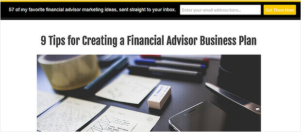
The black hello bar stands out against the white background of the web pages, while the yellow call-to-action button grabs attention.
While we might have preferred more contrast between the button and text color, this floating bar was a success for Advisor Coach, doubling their conversions on those pages.
#3. Drive More Sales
DigitalMarketer was so impressed with the popular hello bar examples that they implemented it on two of their sites: their main site and the TruConversion product page.
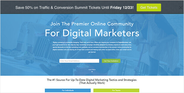
This notification bar uses a bold call-to-action button, making it easy to direct traffic to the right landing page—in this case, for purchasing tickets to an upcoming conference.
Both floating bars feature strong color contrasts and tap into visitors’ fear of missing out (FOMO). One bar emphasized a deadline, while the other highlighted a signup limit.
The results? An 8.45% conversion rate for one hello bar and 6.62% for the other.
#4. Connect With Your Audience
During our research on hello bar examples, we came across a standout from Dogs Naturally.
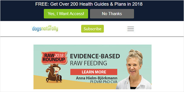
What makes this hello bar effective is the copy. It hooks customers with a lead magnet that highlights a large number, and it stays timely by including the current year.
Additionally, this floating bar uses OptinMonster’s Yes/No forms, which are known for their strong conversion rates.
#5. Educate Your Website’s Visitors
Here’s another clever use of hello bar examples, perfect for content creators. Envira Gallery keeps it simple with a floating bar that encourages visitors to explore more of the site.
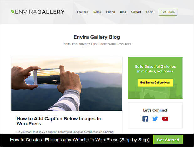
They used a Yes/No form but turned off the No button. The Yes button says “Get Started,” and redirects visitors to a piece of pillar content.
This strategy is smart because it doesn’t ask for anything upfront but rewards the click with valuable content. It’s an excellent way to guide visitors toward content that you know converts well.
What to Do With These Hello Bar Examples
Hands down, these are the best hello bar examples. If you consider the balance between price, performance, and features, there’s really no contest. We recommend that you go ahead and start creating these popups right away.
之后,您所要做的就是为您的网站产生流量,以便您的社交动态能够开始工作。
一种简单的方法是开始使用推送通知。发送推送通知是为您的网站产生重复流量的好方法。如果您对此感兴趣,也应该查看这些文章:
- 推送通知成本:真的免费吗?(价格分析)
- 如何为您的WordPress博客吸引更多流量(9种简单方法)
- 如何提高您的网络推送通知选择加入率(7 种方法)
- 如何为您的网站添加 WordPress 网站通知插件
我们建议使用PushEngage发送推送通知。PushEngage是全球排名第一的推送通知软件。因此,如果您还没有,请立即开始使用PushEngage。


