
Looking for epic 404 page design examples to inspire your own?
The right 404 page can actually help you increase leads and conversions that you would definitely have lost. But what makes a really good 404 page? Can you create a killer 404 page without having to hire a developer? Does is matter how high-end your 404 page looks?
We’ll answer these questions once and for all.
In this post, we’re going to cover 10 of the best 404 page design examples we’ve seen. Then, we’ll explain why they work.
Ας ξεκινήσουμε.
What Is a 404 Page and Why Should You Care?
A 404 page is a custom page you create on your site that’s shown whenever someone tries to access a URL on your site that no longer exists. The purpose of a 404 page is to prevent such visitors from exiting your site immediately.
So, of course, if you don’t have a 404 page, you will lose these visitors. And 404 errors are more common than you might think. Any site that’s been running for a while will have deleted pages and posts.
A good 404 page design can help you retain visitors who stumble onto a 404 error and can then convert those visitors by redirecting them to another page.
Best 404 Page Design Examples
Now that you know what a 404 page design can do for you, it’s time to check out our list of the best designs we’ve seen. If you’re looking to create your 404 page, we recommend using SeedProd to do it. SeedProd allows you to create custom landing pages in WordPress (including 404 pages) without any coding.
Go check out our full review of SeedProd and create your own 404 page. Or, dive straight into our list for some inspiration first.
1. PushEngage
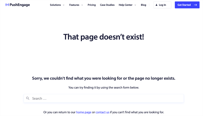
The PushEngage 404 page design is the perfect example of everything you need from an error page. There’s a clear apology message and a search bar that encourages you to stay on the site and search for the resource you need.
It also gives you the option to go to the home page or get in touch with the team.
This way, visitors have the option to stay on the site and keep browsing more content. But even more important is the use of the navigation menu. The navigation menu makes it easy for the user to go anywhere on the site instantly. And having a navigation menu in your 404 page design makes the page feel like it’s part of the same site instead of a random error message.
With this 404 page design, the goal is simple: Keep people on the PushEngage site.
You can straight up use this 404 page as a template. It’s super minimal and highly effective. So, you can re-create the page in a matter of minutes.
#2. 9gag
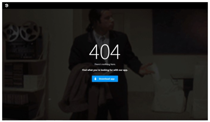
9gag has one of the most direct and straightforward 404 page designs we’ve ever seen. There’s absolutely nothing to consider for the visitor. You get a clear call to action to download their app.
It’s super focused on converting web visitors into app users and that’s all it offers. The page is super minimal and the GIF of John Travolta looking lost is an awesome touch.
Yes, we just talked about offering different ways to retain a visitor. But you can’t overwhelm them with too many options, either. For app developers, this template is pure gold. You can easily create an app landing page and link to it from your 404 page.
#3. Pixar
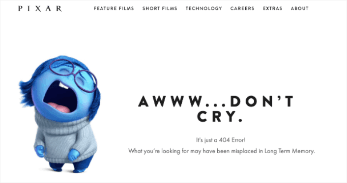
Pixar always takes the cake with creativity. They have one of the most fun, creative, and engaging 404 page design examples.
With one of the characters from their movie Inside Out, they play with how frustrating it can be to land on the wrong page. Then people can use the main menu at the top of the page to go back through the site.
The only critique that we have is that there is no search bar to help users find a related resource. If you’re running a WordPress site, you can set up a custom site wide search engine pretty quickly using SearchWP.
Check out our review of SearchWP to learn more.
#4. Disney
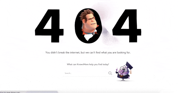
Disney’s 404 page design is also super cool. You get a search bar to find related resources.
But more importantly, everything about the page feels on-brand with Disney. The animated effect with their popular character Wreck It Ralph from their hit movie Ralph Breaks the Internet is super cute.
You also get a navigation menu on top to easily reach any page you want to find. This is an improvement over Pixar’s 404 page design. If you take a closer look at the navigation menu, you’ll see that it points to their Shop, Parks and Travels, and Movie pages. These are all money makers and every time they get someone to convert from a 404 page, it’s money that they would have otherwise lost.
#5. Netflix
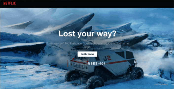
Netflix is more a discovery platform than a search engine. So, for once, we’ll let the fact slide that there is no search bar on their 404 page. And besides, how can you be mad at this design? The background is a scene from Lost in Space.
It’s so fitting that they managed to pull this off.
The main thing to notice here is the big CTA button in the middle: Netflix Home. It’s simple, effective, and very appealing. Seeing a 404 page is a very bad experience for the user. But sometimes, all you need to offer a good UX is a clearly labelled button.
#6. Tripadvisor
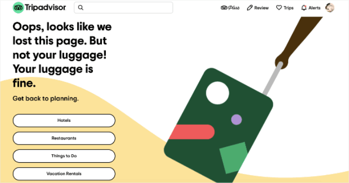
Tripadvisor has a fun and animated 404 page example. It’s a good fit for their brand and the page feels campy and fun. Almost like… taking a trip with a funny friend.
Check out the headline joke about having lost the page but not your luggage. This is the perfect kind of humor for a travel site, and it invites the user to navigate to 4 main sections of their site:
- Hotels
- Restaurants
- Things to do
- Vacation rentals
An excellent way of re-engaging the user and helping them further plan their next vacation without being pushy.
#7. Constant Contact
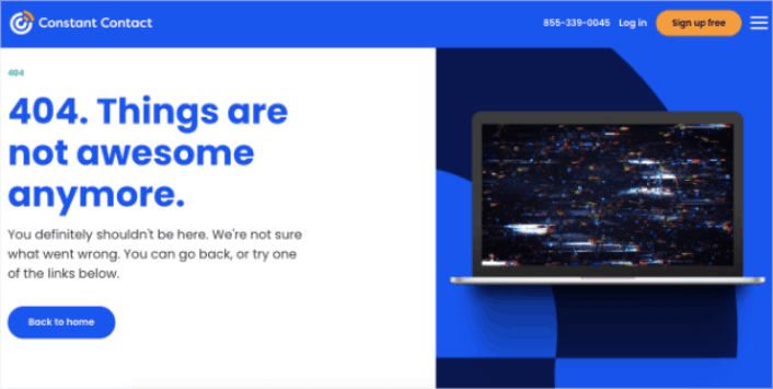
Constant Contact caters mostly to young business owners and marketers. So, while their language may feel a little informal, that’s the way it’s designed to feel.
Ο σχεδιασμός αυτής της σελίδας 404 είναι απλός, κομψός και κατανοεί τη νοοτροπία του χρήστη. Παρατηρήστε πώς ακόμη και με την ανεπίσημη γλώσσα τους, το κείμενο είναι απολογητικό και εξυπηρετικό.
Αν έχουμε ένα παράπονο, είναι για το τελευταίο μέρος του κειμένου. Λέει ότι μπορείτε να «δοκιμάσετε έναν από τους παρακάτω συνδέσμους» και παρέχει μόνο έναν σύνδεσμο για κλικ. Θα προτείναμε είτε να αλλάξετε τη διατύπωση γύρω από το κουμπί είτε να παρέχετε περισσότερους συνδέσμους για εξερεύνηση.
#8. Slack
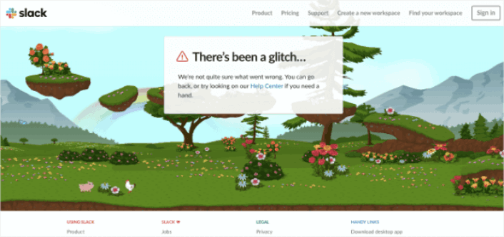
Το Slack δημιούργησε ένα ολόκληρο κινούμενο φόντο για τη σελίδα σφάλματος 404. Έτσι, είναι εξαιρετικά ελκυστικό και έχει σχεδιαστεί για να κρατά τους ανθρώπους στον ιστότοπο για μεγαλύτερο χρονικό διάστημα.
Φυσικά, έχουν έναν σύνδεσμο που οδηγεί τους χρήστες πίσω στο Κέντρο Βοήθειας μαζί με πολλούς άλλους συνδέσμους προς διαφορετικές σελίδες.
Δεν υπάρχει σύνδεσμος προς την αρχική σελίδα Αρχική και αυτό είναι το μόνο που λείπει. Εδώ, ο σχεδιασμός της σελίδας 404 δεν χρειάζεται να περιλαμβάνει γραμμή αναζήτησης, επειδή συνδέεται με το Κέντρο Βοήθειας, όπου έχετε την αναζήτηση του ιστότοπου.
#9. Steve Madden
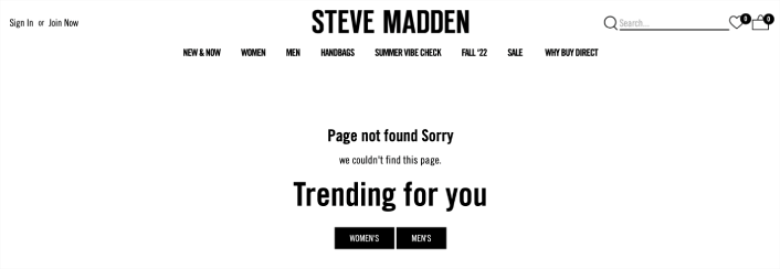
Ο σχεδιασμός της σελίδας 404 της Steve Madden προσφέρει πολλαπλές επιλογές σε χαμένους επισκέπτες. Μπορείτε να χρησιμοποιήσετε τη γραμμή αναζήτησης για να βρείτε προϊόντα στον ιστότοπο. Αλλά υπάρχει επίσης ένα μενού πλοήγησης για να βρείτε σελίδες κατηγοριών.
Στη συνέχεια, έχετε επίσης δύο CTAs που σας ανακατευθύνουν σε δημοφιλή προϊόντα.
Κάθε εκατοστό αυτού του σχεδιασμού σελίδας 404 είναι βελτιστοποιημένο για κλικ για να αυξήσει τον μέσο χρόνο που αφιερώνεται στον ιστότοπο. Είναι επίσης εξαιρετικά εύκολο να δημιουργήσετε μια τέτοια σελίδα. Το μόνο που έχετε να κάνετε είναι να χρησιμοποιήσετε τα μπλοκ eCommerce του SeedProd.
#10. Amazon
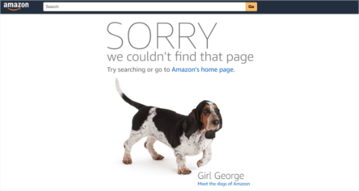
Αν η Amazon διασκεδάζει με τον σχεδιασμό της σελίδας 404, τότε είναι σαφής ένδειξη ότι πρέπει να το κάνετε κι εσείς!
Η σελίδα ξεκινά με μια συγγνώμη με μεγάλα, έντονα γράμματα. Στη συνέχεια, ανακατευθύνει τους χρήστες στην αρχική σελίδα της Amazon Ή επιτρέπει στους χρήστες να συναντήσουν «τα σκυλιά της Amazon». Αυτή η χαλαρή ανακατεύθυνση είναι ένας εξαιρετικός τρόπος για να κρατήσετε τους ανθρώπους στον ιστότοπό τους για μεγαλύτερο χρονικό διάστημα.
Άλλωστε, ποιος δεν αγαπά τα σκυλιά;
Τι να κάνετε Αφού Τελειώσετε με τον Σχεδιασμό Σελίδας 404;
Αυτό ήταν για αυτό το θέμα, φίλοι!
Η δημιουργία ενός σχεδιασμού σελίδας 404 είναι στην πραγματικότητα το ευκολότερο μέρος της δημιουργίας μιας διαδικτυακής επιχείρησης. Το δύσκολο μέρος είναι να δημιουργήσετε κίνηση στον ιστότοπό σας και να κάνετε τους ανθρώπους να αγοράζουν από εσάς σταθερά.
Η σύστασή μας είναι να ξεκινήσετε με ειδοποιήσεις push. Οι ειδοποιήσεις push είναι εξαιρετικά εργαλεία για να αυξήσετε την αφοσίωση και τις μετατροπές σας. Δεν πειστήκατε; Ελέγξτε αυτούς τους εκπληκτικούς πόρους για καμπάνιες ειδοποιήσεων push:
- Πώς να Μετατρέψετε Συνδρομητές σε Αγοραστές Χρησιμοποιώντας Ειδοποιήσεις Web Push
- Πώς να ειδοποιείτε τους συνδρομητές για νέες αναρτήσεις στο WordPress
- Πώς να στέλνετε ειδοποιήσεις επαναφοράς αποθέματος για να αυξήσετε τις πωλήσεις
Συνιστούμε τη χρήση του PushEngage για την αποστολή των ειδοποιήσεων push σας.
Το PushEngage είναι το Νο. 1 λογισμικό ειδοποιήσεων push στον κόσμο. Έτσι, αν δεν το έχετε κάνει ήδη, ξεκινήστε με το PushEngage σήμερα!


